Wednesday 30 September 2015

William Eggleston's Guide

https://vimeo.com/34595129

Bought this book a while back as part of the colour documentary section, but it was a FB post from another student that reminded me that I'd not recorded any reaction to it.

This is partly because at first sight the contents are rather underwhelming. Photos of ordinary stuff in the rather muted colour palette that film of the time produced. I know that it was the first time colour photography was taken seriously as art, but that's not sufficient reason all this time later to enjoy it. So why has it been growing on me ever since I got it.

I think it's because the photos are capable of being read in so many ways. Many can be read as simple exercises in colour composition.  A classic example is the rather prim woman in the blue dress eating her lunch...but wait...what's that chain doing wrapped around the post next to her. Is it deliberately symbolic of the fairly limited life that many women like her must have faced at the time?

The famous tricycle is another case. For me it has come to represent the dominant role that our kids play/ed in our domestic life although it could equally represent the start of a journey out of the image frame and away from home.

The lightbulb and red ceiling...simply an exercise in colour? A study in loneliness? An icon for a sunset missed?

Eggleston appeared to have the knack of making everday stuff interesting, and by isolating moments turn them into opportunities to reflect on our lives. This is a book that continues to repay thought and time spent.

Friday 25 September 2015

Understanding text and images: Brecht's War Primer

War Primer is a collection of images of war, coupled with short pieces of poetry, written and assembled by Bertholt Brecht and published in 1955. It has been wiely analysed as a Marxist critique of warfare, and as an example of the use of captions to provide additional layers of meaning to images.

However, my primary interaction with it is through a paper by Long, in Poetics Today. Long bases much of his analysis on an idea called "interpellation" ...the manner in which the image and text work on the viewer. His easy to understand  description of interpellation is the example of someone (the Subject) calling 'Hey You!' When you realise that they are referring to you, and you respond accordingly - ie you become their subject - then you have been interpellated by the Subject.

Long also notes that there is a lot more to the book than just the imags and their asociated captions, and examines ways in which the end-notes, and even the text on the cover, all serve to layer additional meaning onto the content. He describes this as 'paratextual material', presumably because it is text that runs paralell to the main body of the work.

If I use his basic analysis to look at my own work, I can see that Assignment 3 consists of a series of images, a series of handwritten texts, a series of sketches and drawings, an end-note with the references, a cover with some basic information and an artefact and supporting text.

Each if these can be analysed individually, or in combination with the other to add layers of meaning to the work. So, for example, I have chosen to hand-write the text, and the additional sketch material. This was a concious decision, to enhance the impression of working notes, but it is also indexical to me as the author of the work - perhaps emphasising its authenticity - which adds an additional level to the idea I was investigating, namely the use of differently sourced and authentic material to generate a fiction.

The artefact can be seen in a similar light. It is indexical to the location - it is perhaps, also symbolic of an archaeological link, as is the reference text by Heyerdahl.

The cover too can help with the reading. The plain cover and the reusable post binding all lend to the impression of a working archive rather than a necessarily complete production.

We can apply the same sort of analysis to my 5th assignment. This consists of a set of photos, but the only texts are the editorial introduction, and the title and date on the cover. In truth this is a much more sparse set of texts - I am relying on the format to provide the idea of a journal/magazine. The editorial conveys the intent and is, I hope supported in that by the title text.

I'm not quite sure where all this is taking me except to observe that reading Long has really pressed home the importance of considering all aspects of presentation. It's one thing to think..."Of course presentation matters, no-one wants to provide messy work" and another entirely to think "If I include the artist's statement as part of the work, how does that impact the reading of that work compared with providing it separately."

Something else to take with me to Level 3.

Reference
Long, JJ; Poetics Today; 29:1 (Spring 2008)

Street Names

It seems a shame that I came to a decent understanding of the full scope of documentary rather late in the game. I'm not sure that I think the course material was especially helpful in that respect, but it's done now.

As I look around there seems to be a huge number of subjects that might bear the "documentary" eye.

Street names is a case in point. Returning, as I'm wont to do to Briet's definition of a document I think it is at least reasonable to suggest that street names fall into this category. They are "texts" that are preserved to provide some kind of evidence.

A couple of examples here. First up Bessemer Way...which together with a Weatherspoons called "The Henry Bessemer" is pretty much all that is left of the memory of Henry Bessemer, whose converter for the manufacture of high quality steel petty much shaped Workington as it is today.


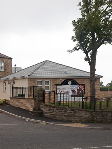
He was almost directly responsible for the role of the second example...James Duffield...who was one of the first managers of the steel and iron works which dominated Workington for the best part of a century.


I'm sure these names are dotted all around us...by and large simply part of the scenery that gets forgotten. As a final example..and I'l have to add a photo later...there is a relatively new development of houses in Aspatria called Sheila Fell Close. Until I looked it up I had assumed it as the name of some local hill...then I discovered she was actually a local artist of some repute.

This would have made good material for an assignment had I but understood better. As it is I can still see a way of fitting it into the final level stuff I'm thinking about....perhaps it's worthy of a project on its own. If I get the chance before assessment I'll post some more examples here.

Sunday 20 September 2015

Meals I've eaten

It struck me as I was reviewing the photos I've taken in couple of years this course has run that I have a lot of pictures of food. Mainly, but not exclusively these are meals I've had on holiday, and as a way of recording the experience of a holiday they have something to recommend.

If you're the sort of person who like sampling local culture it's going to show in the food you choose to eat...if you're a high-roller that's going to show to...to be honest even if TV football and "genuine fish and chips" is your thing that's likely to come through as well. Which must give the idea some claim to documentary status.

Of course, it's non-trivial to sort all those threads. The fact that i have drawn the distinctions I have is indicative of my own personal prejudices, but even so, I believe we could make a claim for documentary status.

It's not an original idea either... pretty sure there's a photographer who photographed everything they eat for a week, which must be the ultimate dieting aid. I'm not that enthusiastic but for starters here's a couple of examples from my more recent culinary experiences.


Seychelles


Asturias, Spain


Thursday 17 September 2015

Research Notes

I generally log my research activity on OneNote as well as in a written logbook. For the sake of completeness the OneNote file is saved here as a pdf. Note that this is quite a large file (12Mbytes) and is only accessible to OCA students for reasons of copyright.

Tuesday 15 September 2015

A few more changes

Assessment really helps focus the mind on what it is you are trying to achieve.

Assignment 1: As a set of postcards this felt a little - unsupported - the reading perhaps just a bit too vague. I have decided to submit them for assessment in a slip case I prepared from a copy of an old hotel receipt. Matching the form to the message is an important technique for supporting a particular reading. I've also changed the name to "Wish You Were Here" as it seems to capture the idea of separation from my local community more accurately.

Assignment 3: As well as the images I have included a genuine artefact recovered from the beach in a plastic envelope on one of the pages. The additional real object seems to me to add to the authenticity - perhaps its indexicality could be seen as parallel to and supporting the indexicality of the images. It's also worth noting that on the interleaving pieces of tracing paper I have made notes of the dimensions of some of the objects pictured, together with brief location notes...again to add to the sense of authenticity. All the text is handwritten and in pencil.