Showing posts with label Research Point. Show all posts

Wednesday, 30 September 2015

William Eggleston's Guide

https://vimeo.com/34595129

Bought this book a while back as part of the colour documentary section, but it was a FB post from another student that reminded me that I'd not recorded any reaction to it.

This is partly because at first sight the contents are rather underwhelming. Photos of ordinary stuff in the rather muted colour palette that film of the time produced. I know that it was the first time colour photography was taken seriously as art, but that's not sufficient reason all this time later to enjoy it. So why has it been growing on me ever since I got it.

I think it's because the photos are capable of being read in so many ways. Many can be read as simple exercises in colour composition.  A classic example is the rather prim woman in the blue dress eating her lunch...but wait...what's that chain doing wrapped around the post next to her. Is it deliberately symbolic of the fairly limited life that many women like her must have faced at the time?

The famous tricycle is another case. For me it has come to represent the dominant role that our kids play/ed in our domestic life although it could equally represent the start of a journey out of the image frame and away from home.

The lightbulb and red ceiling...simply an exercise in colour? A study in loneliness? An icon for a sunset missed?

Eggleston appeared to have the knack of making everday stuff interesting, and by isolating moments turn them into opportunities to reflect on our lives. This is a book that continues to repay thought and time spent.

Thursday, 17 September 2015

Research Notes

I generally log my research activity on OneNote as well as in a written logbook. For the sake of completeness the OneNote file is saved here as a pdf. Note that this is quite a large file (12Mbytes) and is only accessible to OCA students for reasons of copyright.

Sunday, 14 June 2015

In a bamboo grove - Ryƫnosuke Akutagawa

Bamboo grove with graffiti: Melbourne 2004I came across this excellent little story in a Penguin Little Black Classic (The Life of a Stupid Man) which is available for next to nothing in print or on Kindle. It tells the story of a murder (or perhaps suicide) through the words of seven separate witnesses, and in so doing questions the very nature of truth and evidence. Each story unquestionably deals with some or all of the facts as we “know” them, and uses them to build a picture in which a number of people could be guilty of causing the death, and in which at least three people confess with more or less equal believability.

There is a detailed analysis here – furusatoe – and I think both that and the story are well worth the few minutes for anyone interested in exploring why we believe what we believe, how evidence is constructed and interpreted and how personal and cultural preferences steer our reading of such material.

It also offers up for examination some of the tricks that people use, consciously or unconsciously, to “prove” that their version of events is the correct, including such obvious ploys as use of authority, use of confidence, the “I’ve nothing to lose by telling the truth approach” and appeals to the feelings of the onlooker.

Its applicability to photo essays, and documentary photography in general seems clear.

Bibliography

Akutagawa, R., 2015. In a bamboo grove. In: The life of a stupid man. Little Black Classics ed. London: Penguin, pp. 1-15.

Anon, 2013. In a Bamboo Grove: An Analysis on the Nature of Truth and Human Perception. [Online]
Available at: http://furusatoe.tumblr.com/post/41761060829/in-a-bamboo-grove-an-analysis-on-the-nature-of
[Accessed 14 June 2015].

Saturday, 9 May 2015

Battleground images – a thought

The course notes repeat the widely accepted assertion that Fenton manipulated the cannon-balls in Valley of the Shadow of Death. Before moving on to consider images in which bodies appear to have been posed the notes then say “Physically manipulating a battleground scene is surely objectionable enough.” I’m not sure I agree with the sentiment implicit in this.

In what sense is moving cannonballs objectionable? Presumably the course author is not trying to suggest that no battle occurred, and that at some stage there were not cannonballs on the road, as we all know the former to be true and it’s seems highly unlikely the latter would be false unless cannonballs were handily designed to deposit themselves in a ditch after firing. While the fine detail of the image may well be incorrect (rather like the absence of colour) there does not seem to be any evidence that the photographer was trying to invent a battle where none occurred.

The image title on the other hand is a complete fabrication – the charge of the Light Brigade occurred elsewhere. Whatever else happened at this location no-one galloped “half a league onwards” here. So what we have appears to be an early example of documentary fiction – which in the circumstances hardly seems to justify the term “objectionable” – especially given the physical limitations of the available technology, and the political limitations of being effectively an official war photographer.

To my mind Fenton’s image is an entirely acceptable method of conveying that something very dramatic – and quite terrifying for the individuals involved – occurred in this location to an audience who had little idea of what was actually happening. I feel the same about Brady’s Civil War images and Beato’s images of the Sepoy Rebellion – even though the latter two photographers were much more graphic in their use of human remains. I do not see any evidence that the purpose of moving the bodies was purely aesthetic. It seems the to me that the aim was/is to convey the true impact of war to an otherwise relatively ignorant audience, and I would argue that these ends justified the means – it may be unpleasant, but it is not objectionable.

As Sontag notes in Regarding the Pain of Others, prior to the Vietnam War many of the most iconic images were probably faked – the only surprising thing is that we are surprised or disappointed by this. With time they have become historical evidence – and as impure in that respect as most evidence. Its seems futile to judge behaviours from the 1850s against standards established more than a century later.

Bibliography

Open College of the Arts, 2015. Photography 2: Documentary. Barnsley: Open College of the Arts.

Sontag, S., 2004. Regarding the Pain of Others. London: Penguin.

Toler, P., 2012. In the Valley of the Shadow of Death: Roger Fenton's Crimean War Photos. [Online]
Available at: http://www.historynet.com/in-the-valley-of-the-shadow-of-death-roger-fentons-crimean-war-photos.htm
[Accessed 09 May 2015].

Zhang, M., 2012. Famous ‘Valley Of The Shadow Of Death’ Photo Was Almost Certainly Staged. [Online]
Available at: http://petapixel.com/2012/10/01/famous-valley-of-the-shadow-of-death-photo-was-most-likely-staged/
[Accessed 09 May 2015].

Saturday, 7 February 2015

Possessed

One feature of having a real block is that all sorts of things you should have done get skipped. I’ve got my work cut out now to put that right, but that’s my own fault. The beginning of November saw the 3rd Carlisle photo festival (which I’ll write up elsewhere), but one of the exhibits which really grabbed me – and has grown on me ever since was Possessed by Sarah Faraday and Yujiang Wang.

The Possessed project – which can be found at www.possessed.org.uk – “operates by participants giving up objects of personal importance…” In return the artists take two photos – one for the exhibition and one for the participating donor. According to their statement the process of documenting the objects serves a dual purpose – it is part of the act of letting go and it serves as a reflection on the role of the image as an archival document.

On the face of it I think it also asks questions about how we see photos of objects - do we see them as photos or do we see them as the objects themselves? I seem to recall Barthes (or was it Sontag?) expounding on something similar with pictures of deceased relatives standing in for the person themselves in family conversations. Few of the participants feelings on this issue are actually recorded – Leila’s jeans is an exception, where it is clear that the image hovers on the boundary of actually replacing the jeans in terms of the emotional attachment felt. Travel memories falls into a similar category.

A more tricky question – asked by the artists – is “Can the camera capture anything of the emotion invested in an object?” On the face of these images I feel the answer is probably not. This is not a failing of the artist – simply a reflection that deadpan photography is not ideally suited to this task. yes – we can wonder what caused all the dents and dings in the spanner, why and how a pair of climbing shoes got so battered, and we can surmise some things about the owners life on the basis – but I think it’s stretching it to say that they can illustrate the emotional links in isolation without some supporting contextual material – as in this example where there is a hint of something more personal. Berger makes much the same point in “Another way of telling”.

Other material

Sarah Faraday’s website: http://www.sarahfaraday.co.uk/

Yujiang Wang’s website:http://www.xaphire.de/

Sunday, 1 February 2015

Semiotics: Blood swept land and seas of red – the construction of meaning

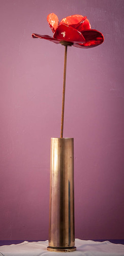
Poppy and shell case

I’ve recently taken delivery of one of the ceramic poppies from the Cummins/Piper artwork “Blood swept lands and seas of red” which was on display at the Tower of London from July until November 2014. I’m not quite sure about the overall artwork, which strikes me as a little cliched – although I don’t buy the criticism relating to it only representing the 888,246 British WWI dead.

However, the individual poppies struck me as what Sherry Turkle would call evocative objects (Turkle 2007) – provocations to thought, which is why I successfully applied to buy one. There is little tradition of military service in my family beyond that required by National Service – in as much as I have any details I know one of my grandfathers was a PoW in WWI and my father served in naval dockyards but no more. So how does this poppy make me think – and how does it help me relate to a field of activity of which I have exactly zero experience?

In examining this I’m going to use a framework based on semiotics, and used by Susan Pearce in an essay examining how we assign personal meaning to a jacket worn at the Battle of Waterloo (in Pearce, 1994). The poppy and the shell case are a text which we can analyse to understand how meaning is acquired. The photograph here is indexical – essentially proof that these objects have existed in this arrangement.

So – we start with the facts. The poppy is ceramic, and as noted above was one of almost 900,000 prepared and displayed to mark the 100th anniversary of the start of WW1. It is unique – in as much as it is hand-made and so features inevitable variations in finish. The stem is slightly rusty mild steel wire.

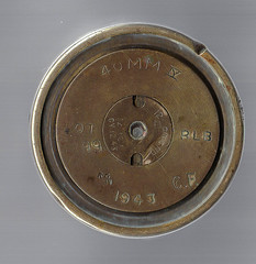
The shell case was purchased in a local antique shop for the specific purpose of mounting the poppy. According to the details on the bottom it was a 40mm shell, and the case was cordite filled at Birtley,Tyne and Wear, in 1943. It had no prior sentimental value for me.

Following the general method of Pearce (Pearce 1994) it’s worth noting the general background against which the articles were produced. The shell is perhaps easiest – it is, in all likelihood a shell case that was used in a Bofors anti-aircraft gun. It was produced in wartime and its sole purpose was to kill. It is the product of a military industrial culture that was busy defending itself from another military industrial culture and the people that prepared and used it understood this at some personal level.

The poppy on the other hand was prepared in an art studio – of sorts – by hand, for the purposes of an art exhibition. Views on warfare at the time of production were very much more mixed. The 100th anniversary of WW1 is also the 100th anniversary of our ability to mechanise slaughter to an appalling degree – the number of poppies reflects that. It was held at a time when the last survivors of the war itself were passing away and into history, and it also came as British involvement in the prolonged wars in Afghanistan and Iraq was drawing to close, an event marked by an apparent desire to recognise the sacrifices of those who died while not condoning the actions of the governments that involved us in the war.

This is part of what Sassure referred to as the langue (cited in Chandler,2004)  – the cultural reference frame in which the text resides. The parole – the specific set of rules used to interpret this text – include the place of the poppy in our culture, the role of industrial markings in identifying items, the way we culturally value things and at a more personal level, my ability to imagine a history for one of the objects on the basis of information found on the internet.
shellcase.jpg

The costs of the shell case and the poppy were not dissimilar, but are arrived at and justified in different ways. The shell case as a military souvenir, the poppy as a unique work of art (or at least a part of one). As Pearce (in Pearce,1997) notes in a different essay in the collection the uniqueness of the hand-made object has acquired a particular poignancy since the onset of mechanical reproduction. Set against that, although the shell case is clearly mass produced the markings on the underside clearly identify it as a unique object, and it bears a number of dents which presumably arose while it was being fired and ejected and cleared away from the gun.

The shell case acts on two levels – it is indexical in as much as I believe it to have been fired in anger (or at the very least in practice anger). It provides a direct link to an act of war and everything that implies and to the military machine that produced it. It is also symbolic – of warfare in general and the live/die circumstances that people often found themselves in.

The poppy acts on three levels – it is indexical of the exhibition, and the production methods that produced it. It does not index warfare. That link is symbolic – a result of a culture that has chosen to associate poppies with loss, sacrifice and the military dead. It is also iconic in the true meaning of the word, as it stands in for both the exhibition as a whole and the wild poppies that grew in Flanders during WW1.

If we take each on their own the meaning is limited – the shell case perhaps make us wonder at the efficiency with which we produce weapons, and unless we are directly affected the poppy induces a general sense of sentimental reverence.

Because of the contrasting nature and meaning of the two items, the combination as portrayed in the image can be read as offering a comment on the way in which the industrial war machine snuffs out the individuality of people. In doing so it turns them from items of general interest into a genuinely evocative object.

References

Chandler, D. (2004). Semiotics: The Basics. New York: Taylor and Francis e-Library.

Pearce, S. M. (1994). Interpreting Objects and Collections (e-Library ed.). New York: Routledge.

Turkle, S. (2007). Evocative objects: things we think with (Kindle ed.). Cambridge, Mass.: MIT.

Tuesday, 11 November 2014

Paul Close – A Snakebox Odyssey

An absolutely fascinating set of travel portraits. Close isolates his subjects against a white backdrop set up in there environment, which simultaneously contextualises the individuals and displays their common humanity. Each photo is presented with their answer to the question “Is there one thing that could make your life better?” As Close notes in the well hidden supporting statement this simply emphasises the commonalities of widely differing people and cultures.

By odd coincidence I came across this site shortly before discovering it in one of the exercises, which asks me to consider whether the same work displayed on a different site is documentary. I have tried to understand why this is more than a trivial question and am struggling a little. For sure it is not what Walker Evans described as “documentary style” but that’s where the difficulty ends for me. It appears to be documentary on a number of levels:

  1. A record of various cultural types across Africa – in this context I think the white backdrop device prevents the series from dropping into the same rut as earlier “colonial” photography. Somewhat counter-intuitively I feel the backdrop removes some of the feeling of looking at “other” perhaps because it isolates their humanity.
  2. A record of a motorcycle trip across Africa – in this sense it is clearly a record of places and peoples visited and has the potential to act as a visual diary
  3. A record of the desires of a mixed sample of humanity at a given moment in time. It would be interesting to be able to compare the wishes expressed in the caption with a similar experiment 50 years ago, and perhaps 50 years from now. How would those desires have changed? Would they be closer to or further from typical western desires (assuming ours is still the dominant culture in 50 years time)
  4. Finally, I think it documents the fundamental desires of people everywhere, pinpointing that the differences are by and large superficial.

For me the whole series is refreshingly free of victim imagery. In spite of the completely different approach to portraying a culture I feel it shares with the work of RAX a basic desire to show people as what they are – people like us, with their own desires and problems.

Sunday, 2 November 2014

Documentary music

This spins out of my interest in documentary things – which I’m going to have to start recording properly – and is really something of an aside, but here goes anyway.I received Electric Counterpoint composed by Steve Reich for my birthday, and on the same CD was a piece called Different Trains which mixed voices an music around the theme of railways.I was interested to see that Reich considers it to be a documentary form, and in this video (at 1:45) he is very clear that he believes the piece works because the documentary reality and the musical reality are one and the same. He uses the same style in a piece about 9/11

It seems to me this has parallel implications for photographic documentary – if the photographic reality and the documentary reality do not coincide there is a loss of integrity. This poses real challenges for documentary photography in the art gallery. In my experience hi-tech surroundings and lush production values do not sit well with narratives of environmental destruction and poverty.

In the cover notes for Different Trains Reich opines that the piece begins a new musical direction. I’m not familiar enough with modern orchestral music to say how true this is but I can certainly see reflections of it in e.g. Autobahn by Kraftwerk.

Not sure where this is going other than that it feeds my tendency to feel that photographic documentary should be about humanity – not simply feature people. If something as abstract as music can convey a documentary narrative, then so can concrete things.

As a footnote I do wonder if Vaughn-William, Grainer and Bartok pre-date Reich as musical documentarists with their interest in collecting and re-setting folk music..

Thursday, 9 October 2014

Inventing Vivien Maier

While completing the research point on Vivien Maier I was struck by the similarity of her position and that of Atget. Both produced huge quantities of work and both have had their work interpreted/reinterpreted later by people with agendas of their own – in Atget’s case the surrealists and subsequently the institutions trying to actively develop a photographic canon, and in Maier’s case a small group of people trying to capitalise on the value of a previously unknown hoard of street photos.

I’m not saying that this reflects on the quality of the individual photographs – there are some real gems on the Vivien Maier website – but it is an inescapable fact that we have very little knowledge of how Maier would have displayed these images. On the basis of even the small selection available on the site she seems, like Atget, to have been quite promiscuous in her choice of subject and this in itself means that we are not judging her work alone – we are judging the work of the curators as well. What is it they are trying to achieve? How do we fit her in to the canon on this basis – until recently she can hardly have been influential – modern street photography developed in her absence, so what are we to make of claims such as “..one of the greatest street photographers of the 20th century.”? Even the idea that it is “the Official website of Vivien Maier” website is slightly ridiculous – it is, if course, the Maloof Collection website. It is none the worse for that, but surely it must impact on our reading of greatness.

A bit of web research reveals that all this, and much more is discussed much more eloquently and in much greater detail by Abigail Solomon-Godeau here and Malcolm Jones here. For the meantime I think it is always wise to be aware of hype. A couple of hundred images carefully selected from an archive in excess of 100,000 is a pretty small sample from which to rush to judgement – one way or the other.

Monday, 25 August 2014

Psychogeography

On the face of it this seems like an interesting concept – the interaction of our geographical location with our feelings and emotions. As the course notes observe it is a term that was coined by Guy Debord a french Marxist theorist, but has its routes in the earlier idea of the flaneur – an individual (almost exclusively male I think) who wandered the city streets being led by his feelings, observing city life and, as far as I can tell, doing nothing useful!

The idea is sufficiently interesting that I obtained a copy of Coverley’s Psychogeography which sadly I found rather heavy going. As presented psychogeography is a metrocentric activity which Debord saddled with the task of providing at least a partial basis for the development of a “new urban environment that both reflects and facilitates the desires of its inhabitants”. In this context the flaneur of early literature became the explorer who identified the psychogeographical terrain of the city – the go and no-go areas – with a view to redefining this terrain. However, as Coverley notes: “Considered solely on its merits as a practical tool at the vanguard of the revolutionary movement, psychogeography must be considered an abject failure.”

This seems entirely unsurprising – the concept is at best nebulous and Debord’s definition was left deliberately vague – but in spite of this I still find some resonance with the idea. Where I struggle is with the ongoing obsession with the city – as if those living outside of London and Paris have no relationship with their geography. The only allusion that Coverley makes to this is to reference those who have made links with daft new-age ideas about ley-lines. But this surely misses the point – why is it only London and Paris that offer pyschogeographic terrains?

As a teenager I wandered the village lanes during the school holidays – turning left or right on a whim – simply observing the countryside. I had favourite locations, and places I seldom went because they felt, frankly, sinister or threatening. I still do it on occasion. Does that not count as flaneury? And if not why not? Sadly this book does not give me an answer – but if you want to understand the historic background to the concept and don’t mind a testing read it’s a pretty good place to start.

Coverley, M., 2012. Pocket Essentials: Psychogeography. Kindle ed. Harpenden: Oldcastle Books.

21 & Research Point: The Farm Security Administration

Before starting this piece of work I thought I understood the photographs of the Farm Security Administration – they were a simple documentary of how tough life was for poor Americans in the mid-west between the wars. And yet, the more I read the more tenuous the idea of the work as documentary becomes. In general the majority of web commentary I have read casts the project (which was just a subset of the actual FSA project) as intended to document the life I mention above Wikipedia captures it as “Photographers and writers were hired to report and document the plight of poor farmers.” (Wikipedia contributors, 2014)

Set against this Price in (Wells, 2009) suggests that the initial role of the photographers in the project was to provide images of workers rather than the displaced poor – and that this latter activity was chosen by the photographers themselves once they were on the road.

The archive itself is huge having been combined with the Office of War Information collection, featuring the work of commissioned photographers and work collected from other sources. In total there are 175,000 B/W negatives, 107,000 prints and around 1600 colour transparencies. (Library of Congress, N/A). Perhaps given this it is not surprising that a curator with a story they wish to tell can select images to create a particular narrative. More surprising to me was the extent to which the individual photographers manipulated scenes to tell the same story as outlined by Curtis (Curtis, 2003).

In some sense this is inevitable – the nature of some of the equipment used meant that the quick “candid” photo was essentially unobtainable. In another sense it was perhaps “essential” – if the photographers wished to identify these people and their conditions as something we could relate to they had to emphasise their ordinariness – the sense in which we could be them. In this sense they are very different from the photos of Hine/Riis – they are not pictures of others they are pictures of people like us.

Were the individuals in the photos exploited? That is more difficult to say. I see no suggestions in the reading I have done that the photographers sought out the subjects that would give them most prominence. Yet as Curtis notes (Curtis, 2003) there are examples where the actual position of the subjects has been betrayed in order to provide the required effect (Curtis cites examples where African-Americans and Mexicans were subject to this treatment). It is also arguable that the subjects themselves were fully aware of the use to which the photos would be put. Florence Thompson, the subject of Lange’s iconic Migrant Mother was apparently assured that the photo would not be published for example. (Williams, 2013)

To add to the complexity of the ethical argument the individuals in some of these photos have been traced, re-photographed and publicised. It is not clear that this attention is necessarily welcome and certainly adds a voyeuristic element to the original images which was perhaps not intended.
Perhaps in a nutshell this is what the FSA photographs illustrate best. It does not matter what the original intent of the photographer was – once the photos are “in the wild” the incomplete nature of photos as documents means they are open to re-interpretation and re-use in a whole range of ways.

Curtis, J., 2003. Making Sense of Documentary Photography. [Online]
Available at: http://historymatters.gmu.edu/mse/Photos/
[Accessed 25 August 2014].
Library of Congress, N/A. The FSA-OWI Collection Background and Scope of the Collection. [Online]
Available at: http://www.loc.gov/pictures/collection/fsa/background.html
[Accessed 25 August 2014].
Wells, L., 2009. Photography: A Critical Introduction. 4th ed. Abingdon: Routledge.
Wikipedia contributors, 2014. Farm Security Administration. [Online]
Available at: http://en.wikipedia.org/w/index.php?title=Farm_Security_Administration&oldid=603350820
[Accessed 25 August 2014].
Williams, V., 2013. What Makes Great Photography. 2nd ed. London: Frances Lincoln.

Saturday, 19 July 2014

Humphrey Spender – Worktown

I think I was vaguely aware of the Mass Observation project of which Spender’s Worktown (Bolton Council, 2014) photos form a part before this course, but it’s certainly not something I’ve ever explored. The overall project is neatly summarised in a rather poorly referenced Wikipedia article (Wikipedia Contributors, 2013) as aiming “to record everyday life in Britain through a panel of around 500 untrained volunteer observers” and critically discussed in some detail in the New Yorker reference linked here.(Crain, 2006)
Spender sought to be, according to a BJP profile from 2000 (Barron, 2000), an “unobserved observer” and if we compare his work with, for example, the FSA work of Walker Evans or Dorothea Lange (Library of Congress, 2012), we can see that he has been quite successful in this, probably as a result of depending on an unobtrusive Contax II rather than the massive cameras used by Evans/Lange.
Whether he has succeeded in recording everyday life is rather more difficult to determine. I’m no social anthropologist, but a review of the photos on display at the Bolton Worktown website do seem to suggest a very limited distribution of class in his images.  It would be relatively easy to jump to the conclusion that his view of Bolton is coloured by his social background – and that is a major criticism of the whole MO project.However in many of his street photos there are very few people of any class. There are very few destitute people in his images to support a charge of social voyeurism and just as few upper middle classes in view to suggest any attempt at “them and us” type contrast.  So against that the photos have none of the campaigning feel of Lewis Hine before him or say, Nick Danziger after. On this basis I think he has at least partially succeeded in conveying a sense of neutral observation. Even if the images lack the breadth of Brandt’s vision (The Bill Brandt Archive, n.d.) – he has left us with a valuable archive of images from a part of Britain that would otherwise have stayed pretty well hidden from history.
References
Barron, J., 2000. 90 and Counting. British Journal of Photography, 19 April.pp. 12-13.
Bolton Council, 2014. Bolton Worktown. [Online] Available at: http://boltonworktown.co.uk/ [Accessed 19 July 2014].
Crain, C., 2006. Surveillance Society. [Online] Available at: http://www.newyorker.com/archive/2006/09/11/060911crat_atlarge?currentPage=all [Accessed 19 July 2014].
Library of Congress, 2012. Farm Security Administration. [Online] Available at: http://www.loc.gov/pictures/collection/fsa/requests.html [Accessed 19 July 2014].
The Bill Brandt Archive, n.d. Social England. [Online] Available at: http://www.billbrandt.com/Galleries/progallery.html [Accessed 19 July 2014].
Wikipedia Contributors, 2013. Mass-Observation. [Online] Available at: http://en.wikipedia.org/w/index.php?title=Mass-Observation&oldid=587740793 [Accessed 19 July 2014].

Friday, 21 February 2014

Here comes everybody – Chris Killip

From what I have seen of Chris Killip’s images on a Google search this book was a bit of a surprise. Instead of gritty real-life shots of child coal pickers and the bleaker side of life in the 80s NE of England we get page after page of engaging – sometimes slightly whimsical – shots of small villages on the west coast of Ireland, and a record of people making pilgrimages to places of unknown (to me anyway) religious significance.


One thing immediately strikes me – and that is the variety of shots and the diversity of the layout – sometimes 4 to a page – sometimes just 1, colour and black and white on facing spreads, mists and sun , landscape and people up close. Overall the sensation is of someone who has fallen in love with somewhere – and it’s inhabitants - and wants to explain why. This is a place where things change slowly, farmhouses appear to decay – only to be revived, walls are repaired with whalebone, religion is a central theme and hayricks are built by hand. And yet - presumably once a year – all is frenetic activity as modern waterproofs are donned and people labour uphill in dodgy weather for a moment of calm contemplation with an ancient saint.

These are among the first colour photos Killip ever published – and the book would have been very different in black and white only. I think it would have lost some of the sense of contrast – an ancient ceremony happening now - if produced solely in black and white. But at the same time, and perhaps counter intuitively, the black and white photos act as an accent – separating the ancient and customary from the current time.

Intriguing – given the standard advice not to mix colour and monochrome in a single presentation. It clearly works if you have a reason for it.


Killip, C., 2009. Here Comes Everybody. 1st ed. London: Thames and Hudson.

Thursday, 16 January 2014

Struggling for traction

I’m getting nowhere - slowly. I’m struggling find a point of contact between what I’m interested in and what the course appears to be about. It appears not to draw a distinction between documentary and social documentary and yet there are definitions and work that seem not to echo this obsession.

A new generation of photographers has directed the documentary approach toward more personal end. Their aim has not been to reform life, but to know it. Their work betrays a sympathy — almost an affection — for the imperfections and frailties of society. They like the real world, in spite of its terrors, as the source of all wonder and fascination and value — no less precious for being irrational . . . . What they hold in common is the belief that the commonplace is really worth looking at, and the courage to look at it with a minimum of theorizing.

- John Szarkowski, from the Introduction (wall label) to the New Documents exhibition, February 28 – May 7, 1967 at the New York Museum of Modern Art.

Rosler , in Context and Narrative takes a dim view of this – describing it as “a poor argument for disengagement from a ‘social cause’ and in favour of a connoisseurship of the tawdry.” Which is fine, but not everyone feels the urge to associate themselves to a social cause, while finding much to explore and understand in our society, its history and its impact on the world.. Seeking to understand does not need to be synonymous with seeking to change – it may simply be an end in itself in the manner of a scientific enquiry, producing records that others can interpret to suit their needs

Another difficulty I find is the inclusion of people every image – leaving me with a clear impression that all documentary photos should include people. This is clearly not the case as a simple viewing of Walker Evan’s American Photograph’s demonstrates. Dyer draws on some of these non-people images in The Ongoing Moment – but having the confidence to follow that route, rather than the examples in the course notes is proving a challenge at present.

If we resort to first principles  - Briet’s definition of a document as “…any concrete or symbolic indexical sign, preserved or recorded toward the ends of representing, of reconstituting, or of proving a physical or intellectual phenomenon.” then essentially all photography is documentary. A series of photos recording the geological progression in the rocks of west Cumbria would count as documentary. In the context of the course however – and this I don’t struggle with – they are documents, not documentary – so where is the middle ground? Is there a middle ground?

I believe there is – I think if we add “involving humanity.” to the end of Briet’s description we are there. To be “documentary” as opposed to simply a “document” there has to be a trace of humanity in the image. This has all sorts of side problems, e.g. why is nature photography not “documentary” – and if it isn’t why do we insist on calling nature programmes on TV “documentaries”? On the other hand – it does encompass social documentary while allowing the type of work Szarkowski was describing, it allows the types of images I was referring to in Walker Evans and e.g. Allan Sekula, it would encompass staged documentary and the work of Taryn Simon/ David Shepherd which I do find some common ground with. So having sorted that out I have a framework which allows me to proceed.

Sunday, 10 November 2013

What is a document?

Useful link to a page about Suzanne Briet who, on initial investigation, appears to have a key role in the development of information science and has something to say on what constitutes a document.

Saturday, 2 November 2013

Documentary photography–a (very) potted history

In many senses all un-modified photography – and some modified or staged photography - is documentary, in as much as the camera records what we choose to point it towards when we press the shutter. The resultant photograph is a document we can subsequently examine for meaning, mnemonic or simple research. However, documentary as a term was first coined by John Grierson in about 1924  to refer to films that were considered to be in opposition to the fantasies produced by Hollywood. This does, of course, set aside the inconvenient fact that the films he first referred to as documentaries, such as Nanuck of the North were almost as much fantasy as “How the West Was Won”.

Setting semantics aside perhaps the earliest work we might recognise as documentary was How the Other Half Lives by Jacob Riis – a study of the underclasses in New York in the late 19th century. Like much of the “documentary” of the time it had, as an objective, the aim of pricking the conscience of the middle classes to do something about the lot of the less well off and this has been a dominant theme of much documentary work throughout the history of photography. Lewis Hine, the American Farm Security Administration photographers and Bill Brandt have all worked in this mode.

A parallel mode has been war photography, which started with the works of Fenton and Beato in the late 1800s and progressed through the 20th century wars with notable achievement such as Capa’s Death of a Spanish Infantryman, and the Vietnam war work of Don McCullin right through to current times with the works of Luc Delahaye and the late Tim Hetherington.

Documentary photography also found use in studying the “other” – people not like the generally white middle class men who took the photographs. Sometimes this was done under the guise of science – such as photos of local people in the far flung reaches of Empire, or people in prisons – but the end result was generally read as evidence that the photographer (and people like them) were in some way superior. Understandably, much modern criticism is directed at this approach, although a cynic might suggest that all we are doing is trying to prove we are superior to the “other” who took these photos in a different time and place.

A somewhat more recent development in documentary photography has been the coverage of banal subjects – everyday life, mundane objects and detritus – which might be seen, I think, as a reaction against the ever rosier views of society portrayed in the commercial media. I can see a trail here that leads from Brassai, Cartier-Bresson and Kertesz, through Walker Evans  and on through Friedlander, Winogrand, Egglestone and Shore up to the present day.

During this history a mode of working has developed which plays to the alleged authenticity of photos as documents – stereotypical documentary style involves the apparent absence of aesthetic considerations, black and white imagery and an absence of obvious post-processing. Another typical characteristic is that documentary photography almost never seems to cover positive events, or portray people rising above their difficulties. I noted this latter tendency at Format13 in Derby – the galleries were full of the photographic equivalent of misery biographies, offering only criticism of the system, and no hope.

It is also notable that most documentary work for most of its history concentrates on people – unsurprisingly – and it is only recently that objects appear to have achieved some narrative value.

Recent developments include the staged documentary such as the work of Bourouissa, the migration of documentary images in to the gallery (e.g. Misrach’s Cancer Alley) and the adoption of a more subjective approach – as exemplified by Moriyama’s images of Tokyo and Goldin’s diary style photography of the life of herself and her friends.

As this is intended as a simple framework on which to hang my future explorations I’m going to bring this entry to a close by noting a couple of areas of personal interest for future investigation. These include – use of objects to tell a story or make a point, inevitably perhaps, the history of documentary in Japanese photography and the use of alternative forms to display documentary photography, which might perhaps help to convey additional information or engage with viewers in a more meaningful way.